Today
is all about aesthetics! The first part of this topic is concerned specifically
with the books, the second with our blogs. Here are some guiding questions to
get you started!
The
Books: How often do you judge a book by its cover? How often are you surprised
by what you find? Do you strategize and make sure every book in your series has
the same cover design (as far as you are able to) and type? How important is it
for the visual art on the outside of the book to match or coordinate with the
literature art on the inside?
I'm going to riff on this topic a little bit but I will start with the judging the book by it's cover question.
I judge a book by it's cover all the time! I say frequently that if there is someone half naked or people making out on the cover I won't read the book. Not that I think there's anything wrong with being half naked or making out - because I don't- but if that is the best thing that you have to offer me to pull me into a book I think I'm going to be left wanting. This probably has left me missing out on a good book occasionally, but I think by and large my code has left me in good shape.(Have I mentioned I'm a little bit of a snob? I might be a little bit of a snob.)
 |
| Cooooooooooooough |
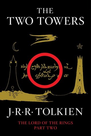
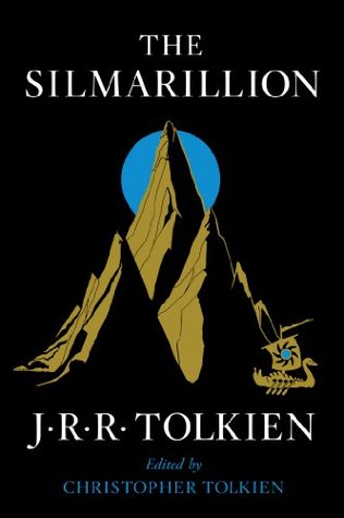
I love it when a series stays really consistent with cover and (if I was a big book buyer I would) totally only buy coordinating covers. Here are my two favorite examples:


I love all of those covers, they're all just a little sinister and a little sinister is kind of my favorite.
Next is one of my favorite series' that follow a German police detective who loses his job because he refuses to join the Nazi party and all of the cases that he gets. I love that the covers reflects the film noir, twilighty, dusty feeling of the books. He has quite a few, so here are my favorites:


Though I will say that ALL of these books violate one of my pet peeves about book covers: when the authors name is bigger than the title of the book. I get why people do it but it irritates me.
Author vs. title is really annoying! Or other accolades like "NYT bestelling author" or worse, a blurb from ANOTHER author, being too large. I get why it's included but not so big! http://mwgerard.com/armchair-bea-16-aesthetic-concerns-in-books-and-blogs/
ReplyDeleteYes! You're right, that's an obnoxious move too.
Deletethose Tolkien covers are gorgeous! and it's pretty darned hard for me to NOT judge a book by its' cover. Happy ABEA week!
ReplyDeleteWell and if we really weren't supposed to do a little cover judging wouldn't they all just be, like black and white no graphics? What a boring bookshelf shelfie that would make!
Delete